Cities grow. Communities multiply. Businesses flourish. When they do, airports must expand in kind in order to properly serve their ever-increasing volume of travelers. The cities of Reno and Tahoe have experienced massive growth over the past years, substantially expanding America’s biggest little city.
When it came time for the Reno-Tahoe International Airport (RNO) to transform itself to accommodate the growth of the region, they had two specific goals in mind. Their first priority is customer experience—including how travelers would experience their airport during the transformation. The second was investing their funds wisely so that they could build upon a solid foundation for decades to come.
Led by Senior Project Manager/Architect Amanda Twitchell, the leadership of RNO assembled a world-class team to aid them in accomplishing their goals. They engaged RS&H Architectural Engineers, and Selbert Perkins Design, a Signage and Wayfinding firm.
“One of the keys to a successful project is in selecting the right team. It was because of the incredible team they engaged, the project was a success from start to finish. Traveler inconvenience was mitigated during construction, and the end result delighted both travelers and the team.” — Andy Davey, Partner, Selbert Perkins Design
As this was the pilot project for the reinvention of the airport, the discovery phase was of prime consideration as this would serve as the master plan for all expansion to come. Therefore it was of great importance to make sound decisions now in order to lay a solid foundation for future expansion.
“Many people had been saying that we don’t need to build ticketing halls any longer because most people check-in online. But we have a lot of leisure travelers with golf bags, skis etc., that need to be checked in. Therefore we found that we still needed a lot of room in that space in order to accommodate our growth.” — Amanda Twitchell, Reno-Tahoe International Airport
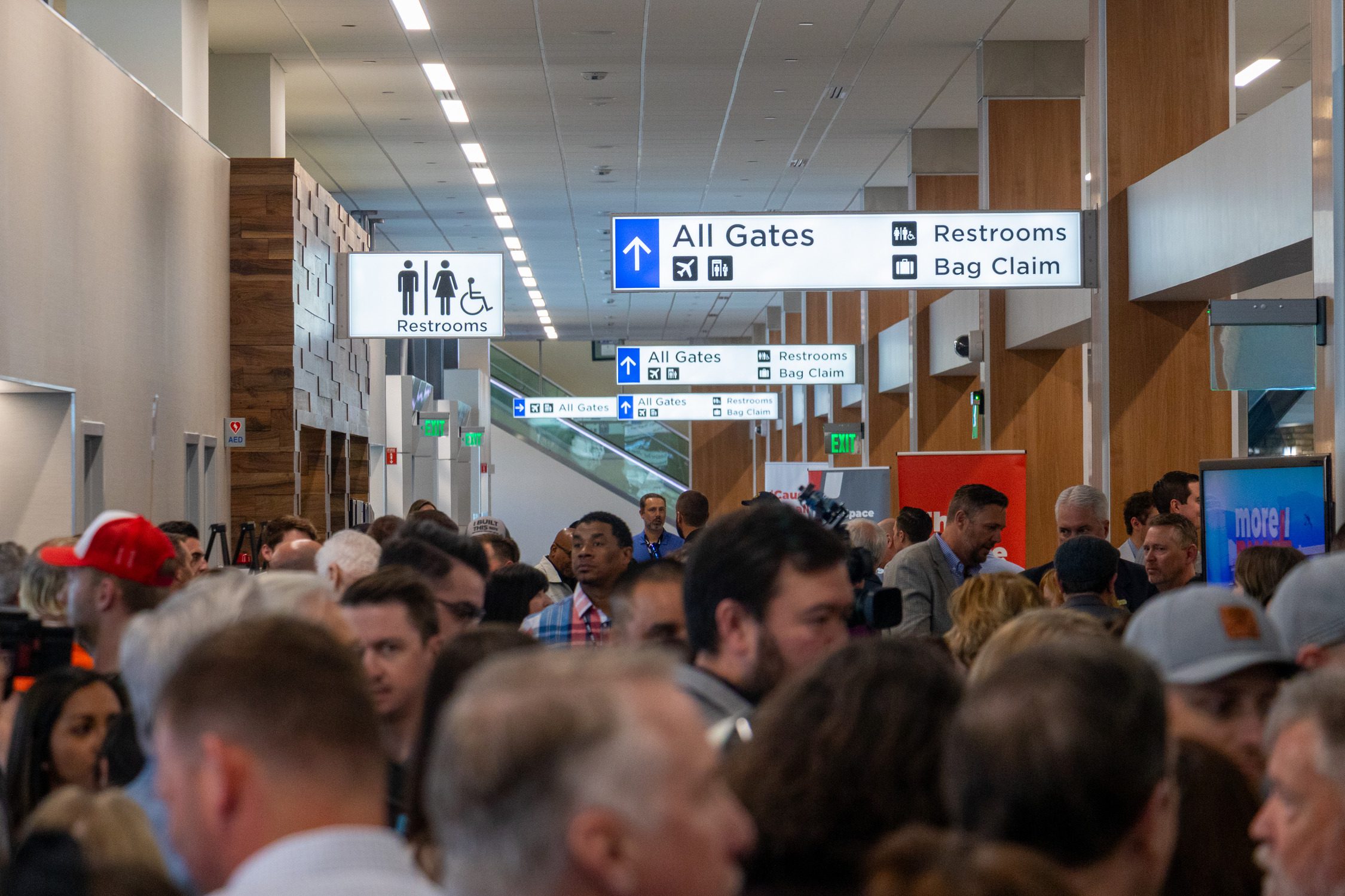
Choosing the wayfinding design system was another of those foundational decisions. Since the traveler experience was of primary concern, the aim was to provide signage that intuitively directed travelers to where they needed to be. After looking at examples from past and current airport projects, the team arrived upon a very clean and concise design, eliminating clutter and all but the essential verbiage. All lettering was designed with black on white, providing great contrast, with a single accent color of blue tying all of the wayfinding together.
“For the signage, we wanted it to be simple because right now, our current signage was just too convoluted. It was too small, it had all of this layering of images and we really wanted it to be very simple and streamlined. We have received a lot of traveler feedback, mostly positive. And I’m not just saying this because we are talking about it, but the signage has been one of the biggest things that people talk about and call out. People have said that we now look like a real airport.” — Amanda Twitchell, Reno-Tahoe International Airport
Selbert Perkins Design is delighted to be helping Reno-Tahoe International Airport with their efforts to better serve their travelers now and wayfinding the future for expansion in the years to come.


