First impressions matter! Unfortunately… people DO judge books by their covers. That is what happens when the outside of an organization does not match its inside.
Cal Poly San Luis Obispo is a world-class university. Ranked in the top 50 Masters-Level universities in the USA. Yet the exterior of the school did not reflect the excellence it provides within it.
Recognizing this, the school leadership set out to bring congruence to their learning environment by providing a professional, practical, and pragmatic experiential environment on their campus.
Through a competitive bidding process, they selected Branding, Placemaking & Wayfinding firm, Selbert Perkins Design, to assist them in this endeavor; to define their specific problems and in designing and implementing solutions.
Some of the challenges that visitors had when visiting the campus were that it was very difficult to find their way around the school, let alone to their specific destination and on time. The campus is spread out, they are expanding and there is much construction going on.
It was very difficult to find where you should park. The campus has many hills, with steep inclines, compounding the problem when you park in the wrong place, having to walk up these hills, under the pressure of now being late for your class or appointment.
There was no consistent thread tying the ever-growing campus together into a cohesive experience. Visitors had no way of knowing that they were actually on campus. These first impressions did not convey a message of a “world-class” institution.
To assist the school in solving these challenges, Selbert Perkins Design first conducted a comprehensive discovery process to reveal the actual needs of the university.
“A key element to the success of the project, was to help the university gather data from all of their key stakeholders; valued voices, experience, opinions and requirements.”
– Robin Perkins, SPD Co-Founder and Partner
“We then analyze all of the data and craft it into a unified and actionable wayfinding strategy. We are very hands on, as consensus building is key to a successful project, and is a highly specialized, core service we provide to our clients.”
Included in the study was a key component of providing highly effective wayfinding; a Visitor Journey Map. This is a process of identifying all of the touch-points the visitor experiences on their way to their final destination. All of these individual visitor journeys are mapped out and used to craft the wayfinding and signage system.
One of our guiding principles for the project was to align with the Core Philosophy of the University.
“Learn by Doing means that we don’t see a difference between the education we provide and the “real world”. Here, experiences are part of the curriculum. That’s because knowledge is inextricably linked to the world around us. To Learn is to Do. To Do is to Learn. At Cal Poly, each fuels the other.”
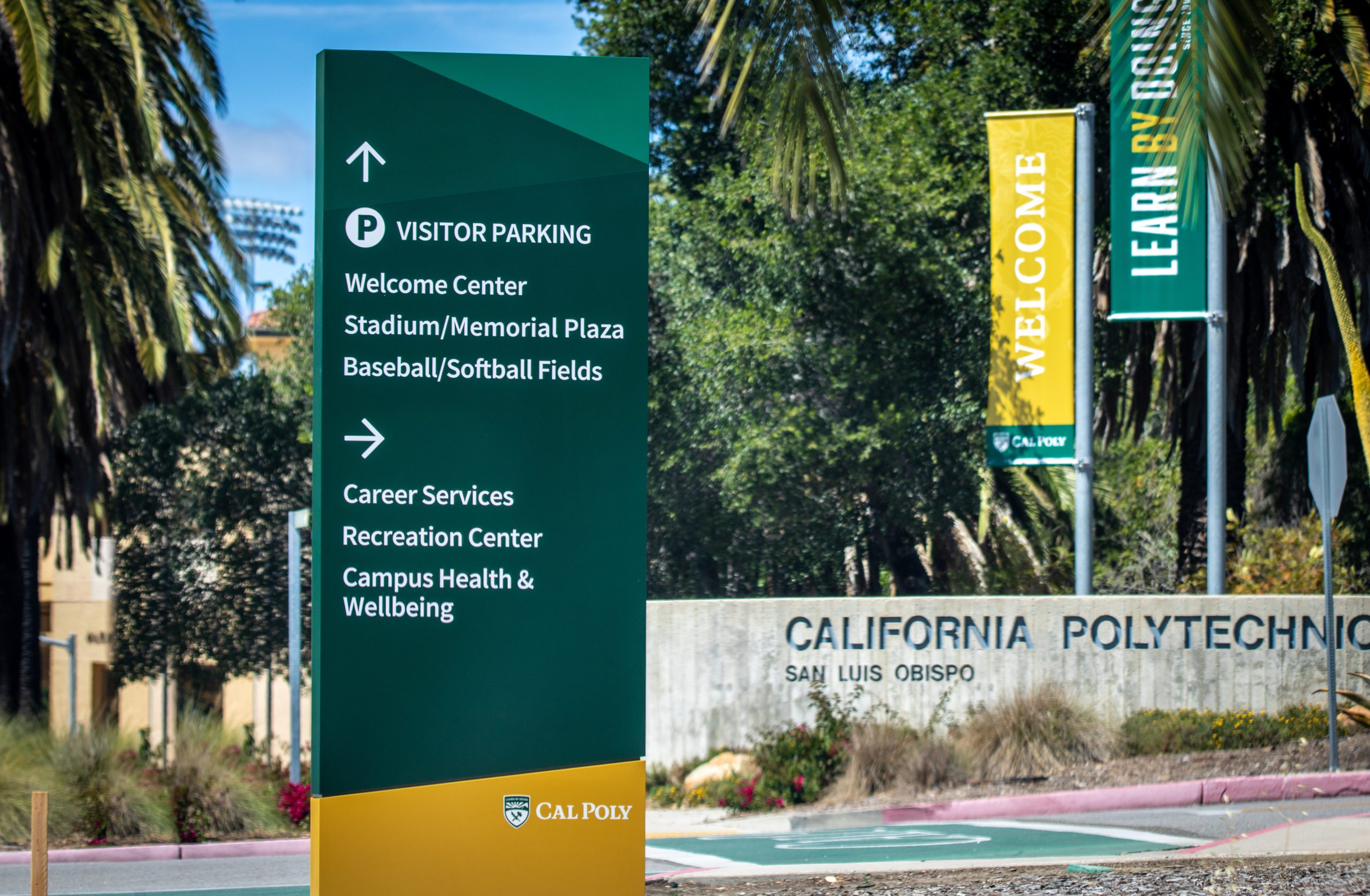
Therefore our design was very professional, practical, pragmatic, and geared towards the visitor experiencing this philosophy as they enter and traverse the campus.
“The elements that highly influenced the design of the sign system come from the core of the campus brand; inspired by place and land, handcrafted, artisanal, historical, natural. The green and gold colors pull from the California coastal farmlands of citrus trees, hillsides, and the golden sun. But it has to explain the highly technical and future-thinking side of Cal Poly as well, which is tech-based, scientific, sleek, and multifunctional. Now the wayfinding elements are truly a nod to the school and the place in which it resides.”
– Andy Davey, Partner, Selbert Perkins Design
Along with the new wayfinding and signage system, SPD developed a parking lot identification system, to guide visitors to the school to the correct parking facilities; commuter, staff, short-term, visitor, and student areas quickly and easily.
Now, whether you are a parent visiting the campus for the first time with your child, a student or faculty making your way to your class on time, the experience for all as they find their way to their destination one that is congruent with the excellence befitting a world-class educational institution.
Congratulations to Cal Poly San Luis Obispo, faculty and leadership in successfully transforming the visitor experience of their university.


